Sort by
Block Pattern: Slim Fit
Charts-as-a-service
Become a long-term, go-to-destination for charts on the topic you specialize in. This is a tangible work product that will save your audiences time in finding data to back their arguments. In fact, often journalists, see charts as pre-content for their articles.
Why it matters: As candid communicators — researchers, academia, analysts, management consultants, bureaucrats, journalists, venture capitalists, policy makers, etc. — we prefer to ground our understanding of the world in evidence and data.
- No additional effort required: As candid communicators you are already creating charts to add to your presentations, reports, and analysis. Go ahead, pull them out and publish your byproducts!
- Stay in touch: This is quick and light content for your communications team to publish on a regular basis.
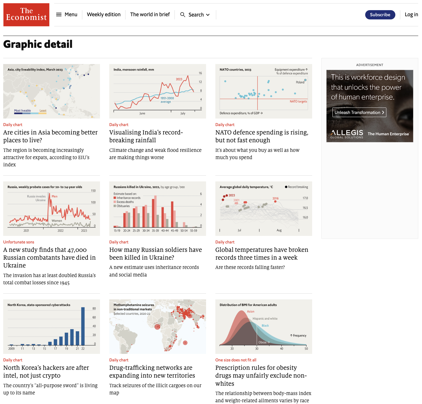
- Brand building: Being data-driven is a big plus in the candid communication market. For example, The Economist is known for its charts.
Here’s how you can publish charts:
Chart Gallery
Chart Gallery
Photo Gallery is a well-established content format that has given billions of page-views. The nerdy version of it is the Chart Gallery. Each gallery is on one topic and is essentially a collection of charts with a crisp description per chart.
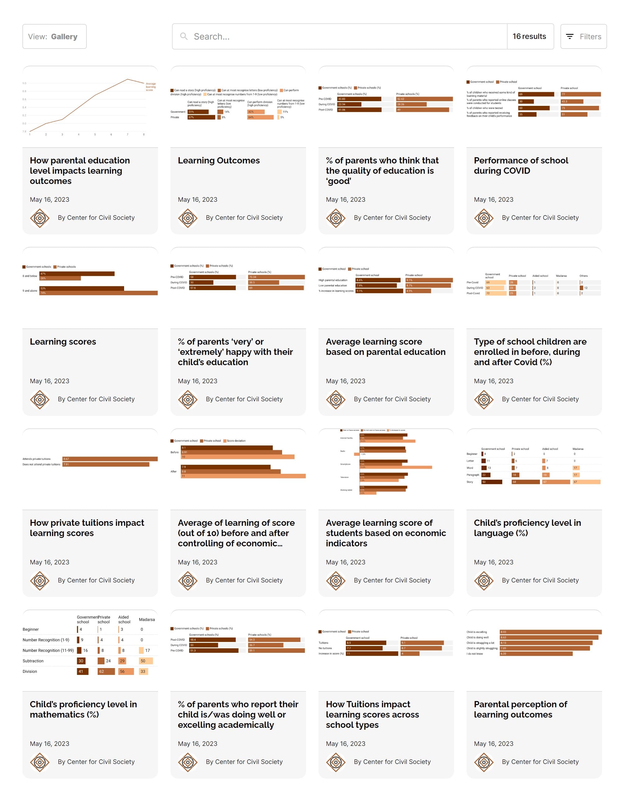
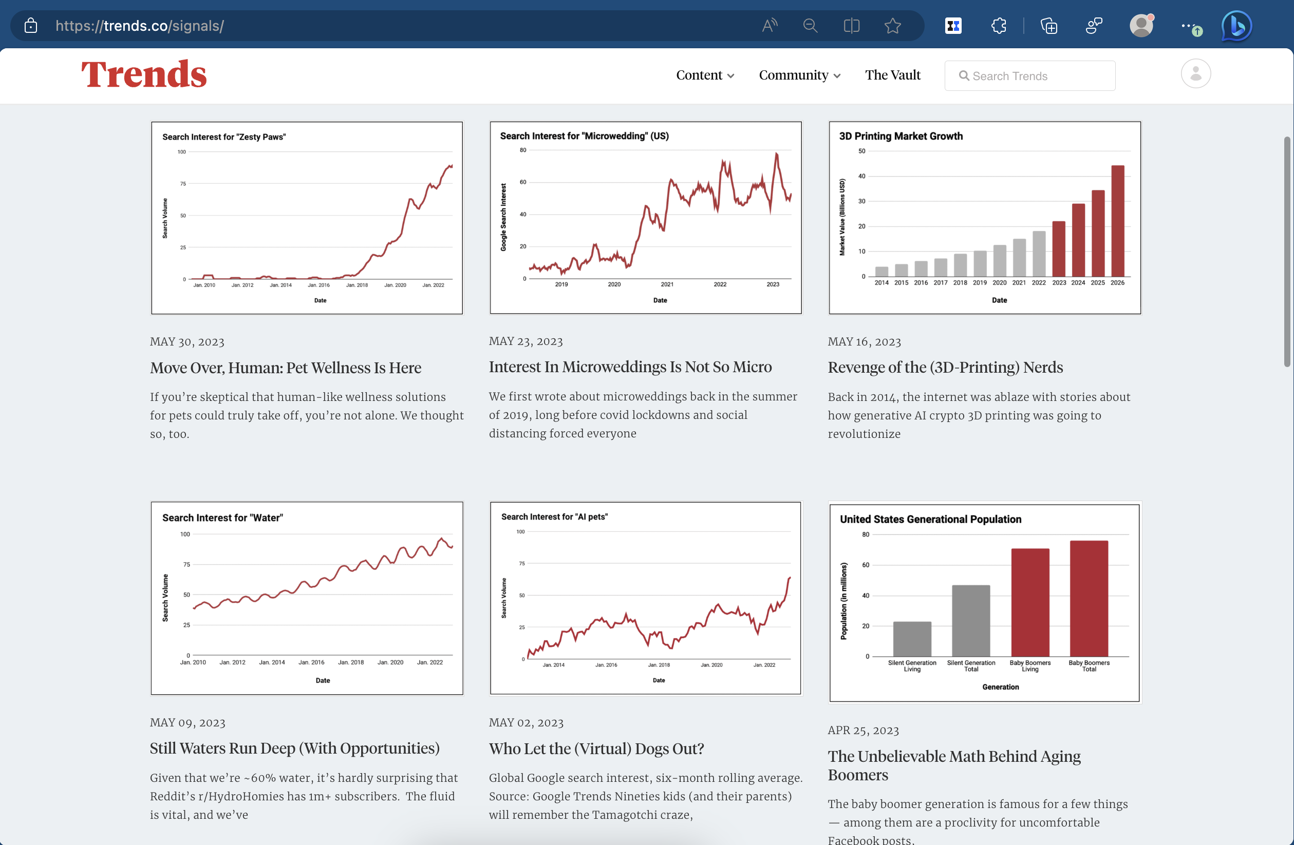
Chart Feed
Pick a topic, say Gender Participation in the Labour Force, and launch a ‘Chart Feed’.
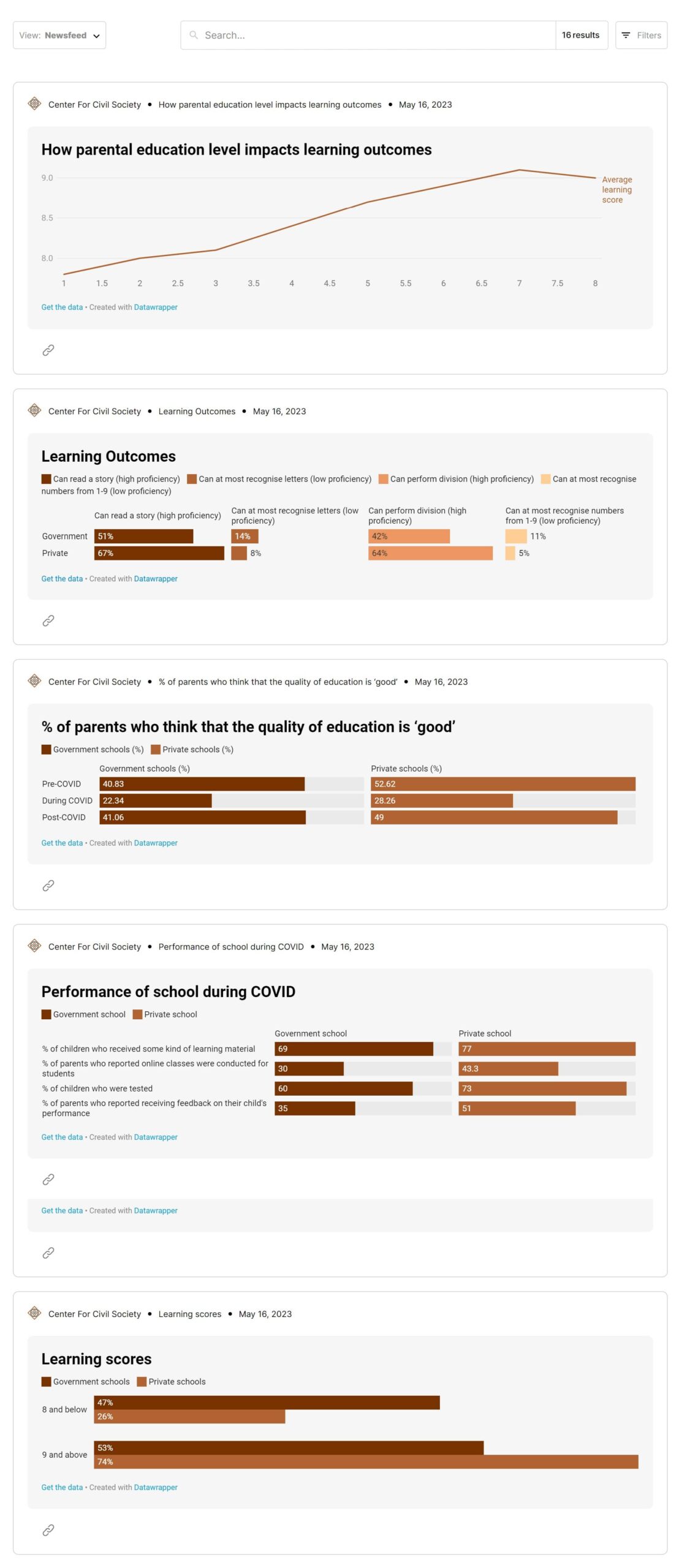
Chart of the Day (newsletter, social)
If you are running a newsletter or have social media handle, then your communications team can pick one of these charts and publish them as ‘Chart Of The Day’. Such products tend to become habit-forming.
- For example, Chartr Data storytelling
- @Stats_of_India and @spectatorindex have collected a vast loyal following serving charts everyday.
Embed charts inside of articles
You can also natively embed these Charts inside of your articles.