Website for Dr. Shelly Batra’s New Initiative: Every Infant Matters
1-minute Snapshot
Who: A non-profit organization serving the disadvantaged population with last mile health solutions and promoting health equality worldwide.
What: Every Infant Matters wanted to revamp its existing website to create awareness for their cause and showcase their efforts and impact they are creating to donors, funders and partners.
Solution: From Godaddy website builder to WordPress website with 20 pages, 40+ posts, and 25 aggregations.
Membership Period: 2022
Products Used: Super Normal, Humane Content

Testimonial
“We didn’t have time and bandwidth to really think about marketing our work at Every Infant Matters. Humane Club not only provided us with better design system and tools but also helped us get the communication right.“
Dr. Shelly Batra, CEO 🇮🇳
⭐⭐⭐⭐☆ Website
Information Architecture
The primary goal of information architecture is to ensure that your audience know about your organization in a few clicks and is able to find relevant content. Your content must be organized or bucketed in a logical pattern so that all the respective pages can be linked to it.
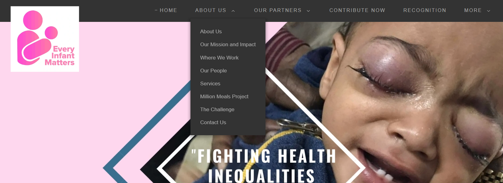
Before
- Missing category around the main work done. Example: The navigation comprises of about, partners, contribute, recognition etc. but doesn’t have a link which can take users to their work page
- No clear segregation of pages in each of these categories. Example: Partners dropdown has a menu item called “Training Nuns and Nurses” which is actually a project/ activity undertaken
- The navigation (header and footer) and pages had no call to action
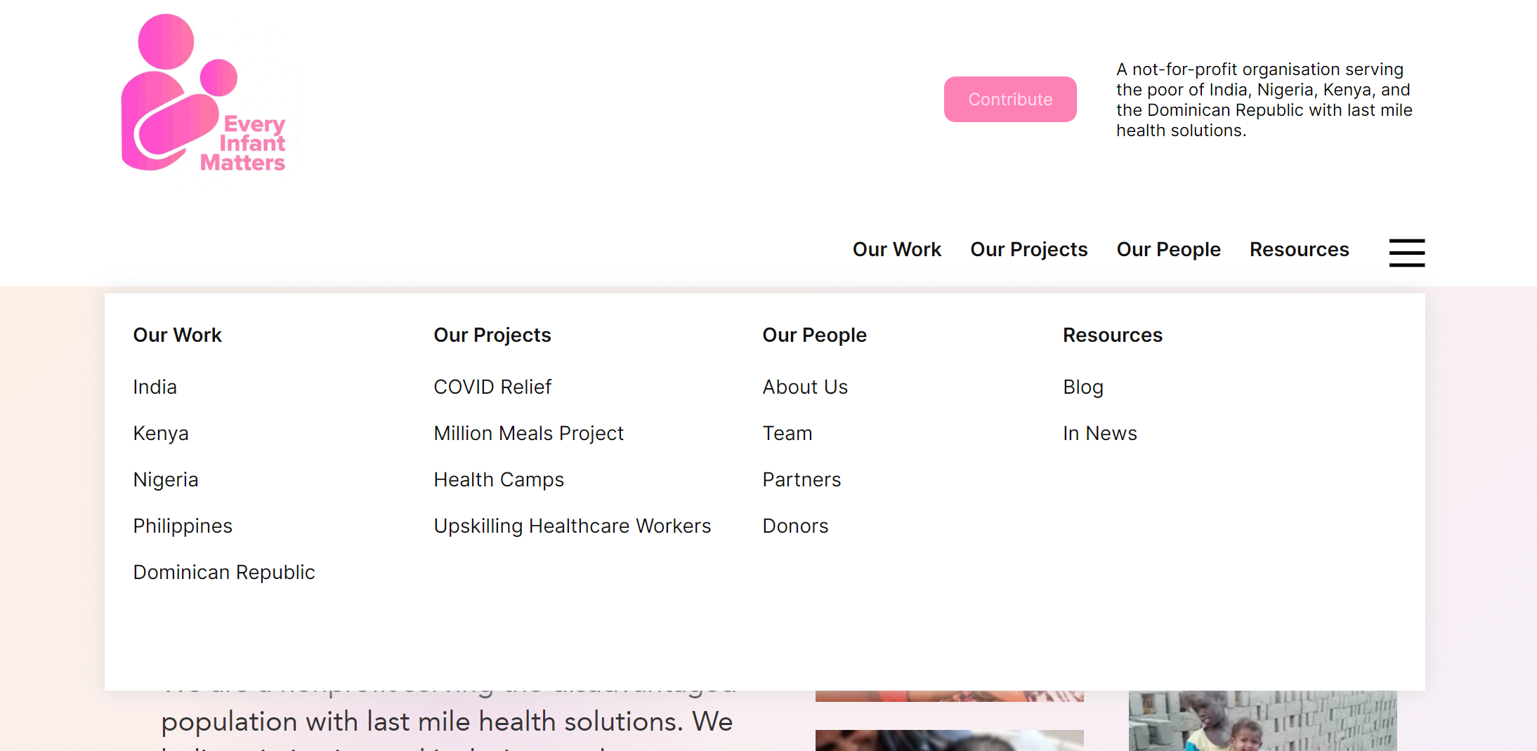
After moving to Humane Club
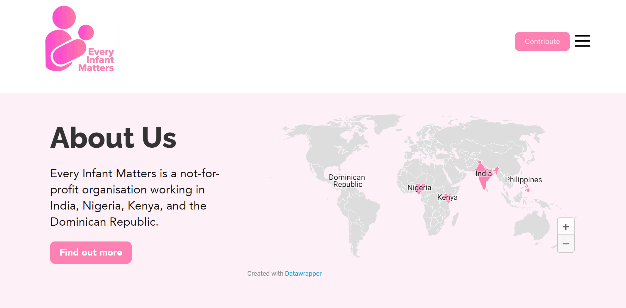
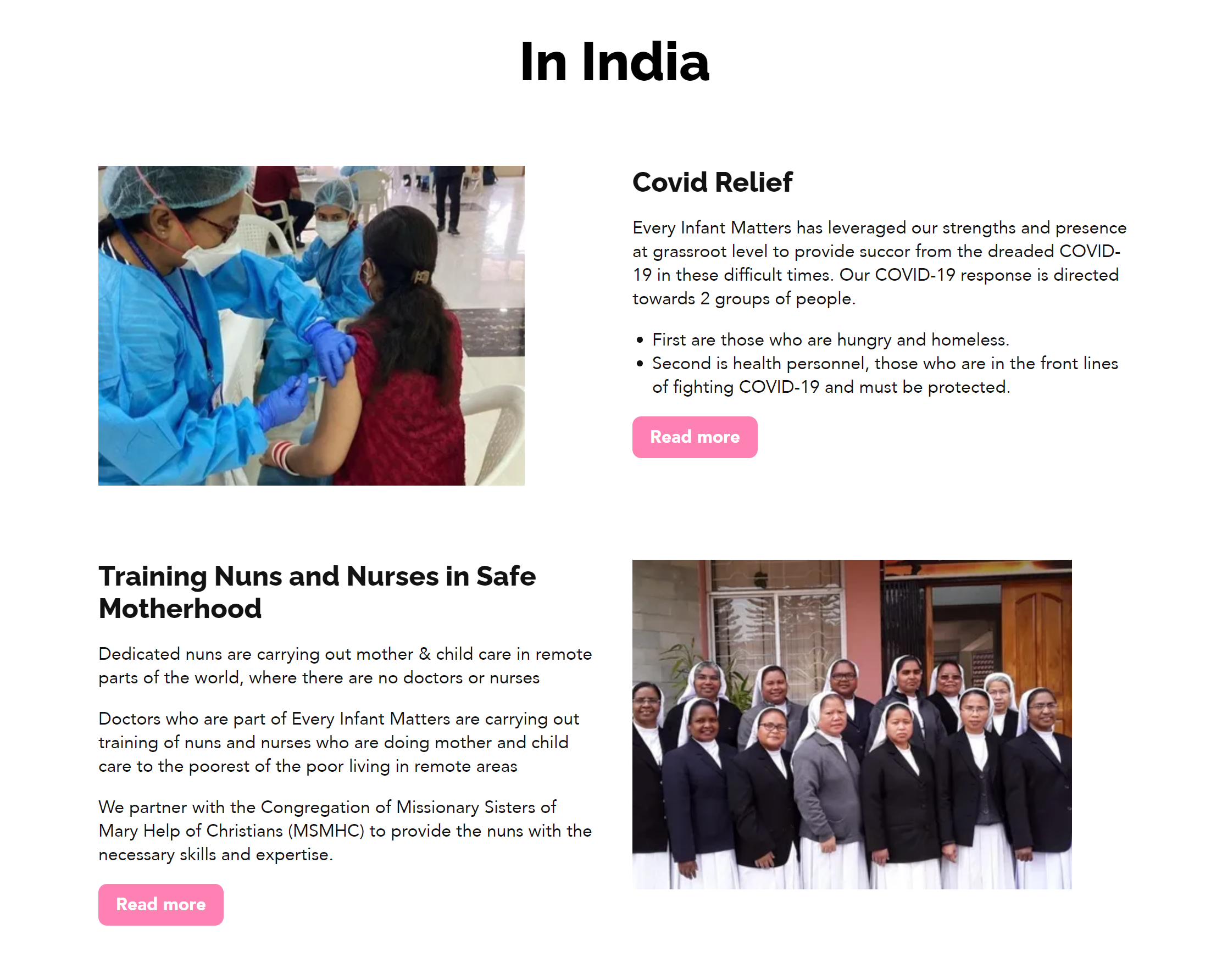
- Created clear categories for visitors to explore work by country (India, Kenya, Nigeria), projects (Covid 19), and people (team, partners and donors) that helps visitors quickly find relevant piece of information.
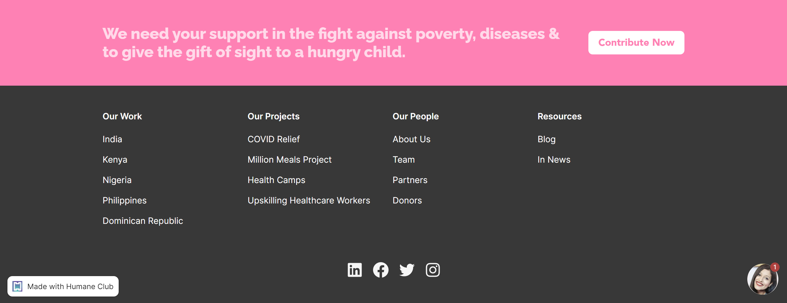
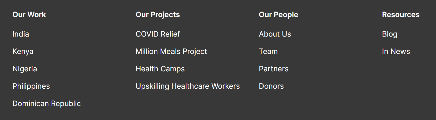
- The footer also lays down entire site map upfront with clear call to action
- Added clear call to actions added both in header and footer i.e “Contribute Now”
Before


After
Homepage
Before:
- The homepage of the website was extremely long
- There was no clear flow of sections and sequence of content within sections
- There were no clear sections that focussed on work they do, impact they create and recognition they have received
- It was used more like a pin up board where anything and everything was placed without clear purpose and structure which made it impossible for the reader to understand the impact that EIM was making
After moving to Humane Club:
- The homepage now focusses on EIM’s geographical presence and work they do in each country
- It establishes credibility through awards, recognition and partner logos
- Testimonials from partners and donors gives social proof
- It communicates impact created by showcasing big and bold numbers
- Each section of the homepage has call to action with references to other pages on the site i.e work, about, partners, news etc.
Before
After
Powering content through YouTube style playlists
Before
- The recognition had all content (blogs, talks, interviews, awards, media mentions, podcasts etc.) pasted right there making it hard to read, breaking the layout and throwing the page off-balance
- The content within the page was not added in right sections Example: Different awards appear at 3 different places on the page rather than a section dedicated to it.
- Moreover, there was no way to filter and search blogs, articles, media mentions etc.
After moving to Humane Club
- All the content piece is either created as a post (for blogs or talks) or an aggregation (for external links). This ensures reusability of the content and also drastically reduces the length of the page.
- Further more, we created two separate pages for different content types — Blog and In the News. Blog page covered all the articles that were published in journals or news media website. Whereas, “In the News” page covered talks, interviews, awards etc.
- “In the News” page have 3 clear sections — Talks & Podcasts, Awards & Recognition, Media Mentions
- Each of these section has filter and search
Before
After
Clean reading experience
Before
- Different pages use different layout and there is no coherence
- Moreover, since there are no posts entire copy is just dumped onto the pages
After moving to Humane Club
- All landing pages have clean and consistent page layouts
- All posts have different layout that offers clean reading experience
Before
After
Using visuals and colors that reflects brand identity
Before
- The color used throughout the website was primarily shade of black despite logo having pink color
- The background color across all pages heavily uses shade of black and grey which looks too overpowering
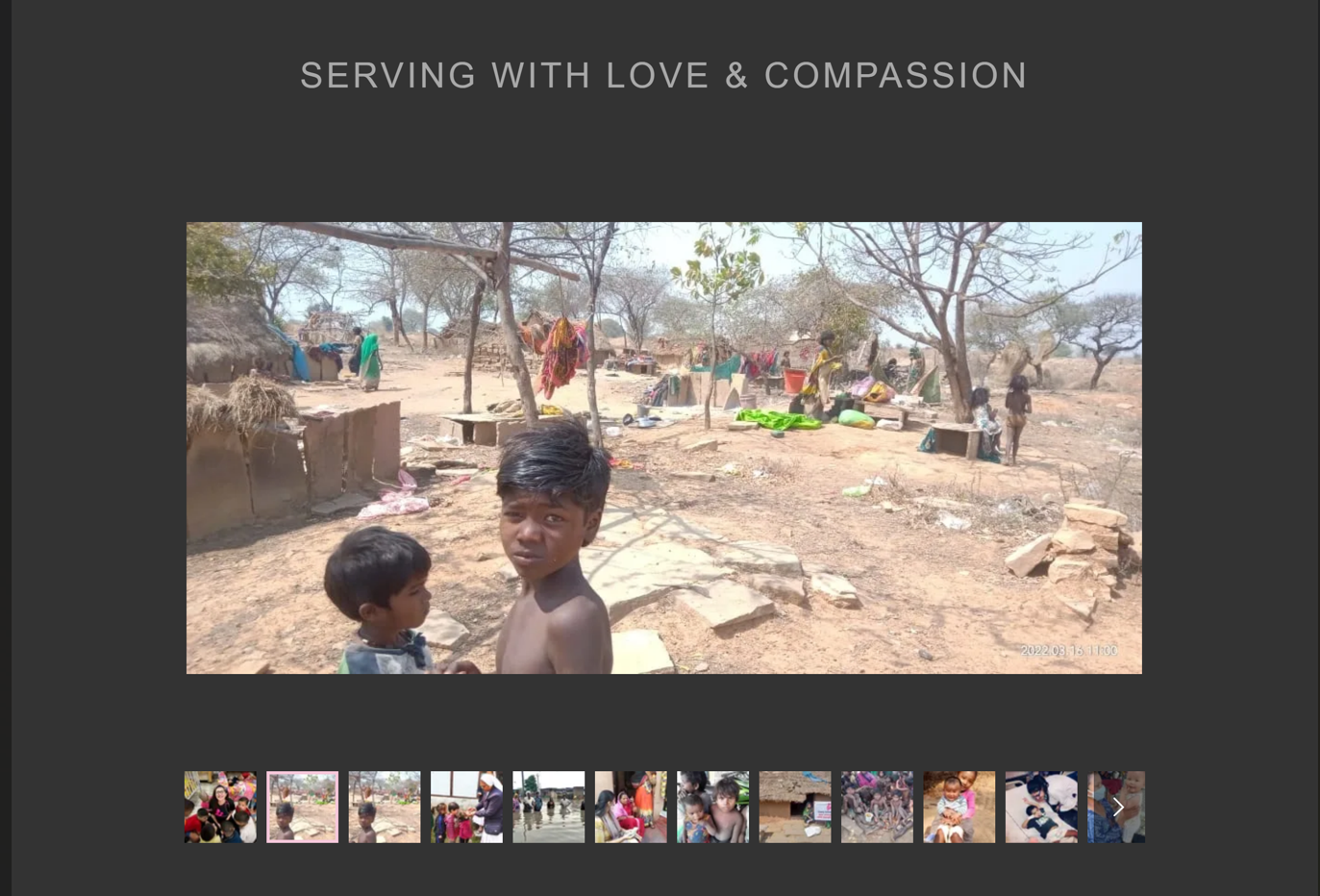
- A dedicated page with gallery of images
After moving to Humane Club
- All call to actions use primary color which is a shade of pink derived from brand logo
- Rather than add background color to entire page, background color is added only to important sections of the page
- Images are used throughout the website to add context and compliment with the textual content.
Before
After