Hey there! 👋 We’re super excited to announce the launch of Chart Gallery. This feature was commissioned by Centre For Civil Society and is now available to all Humane Club subscribers.
You can now launch a ‘Chart Gallery’ on your WordPress Site where audiences can discover all the charts that your team has ever created.
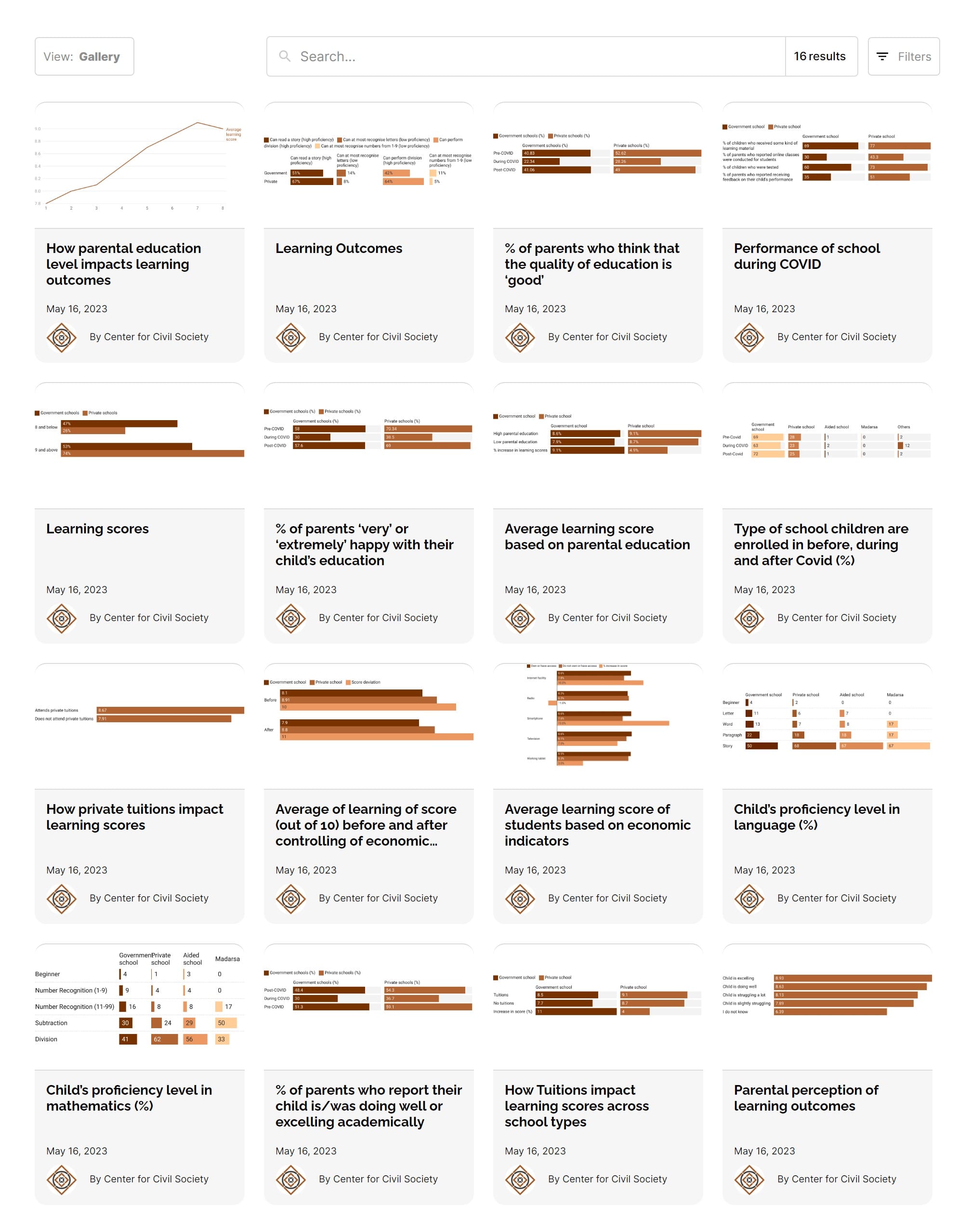
Chart Gallery
Alternatively, similar to The Economist’s Graphic detail section, you too can pick a topic, say Gender Participation in the Labour Force and launch a ‘Chart Feed’.
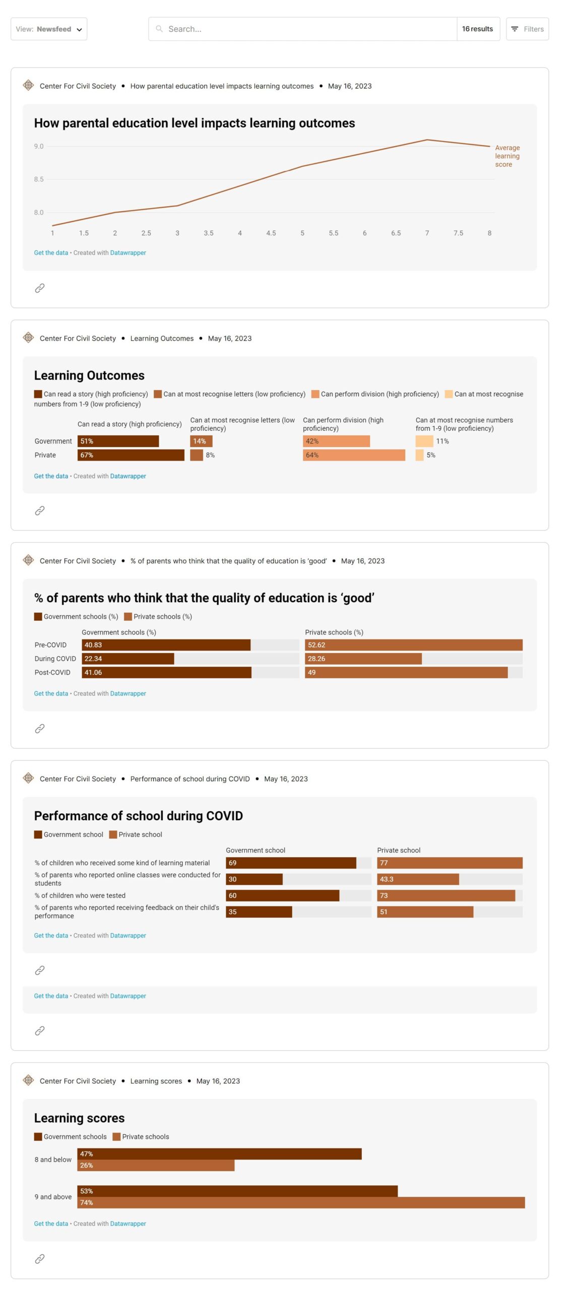
Chart Feed
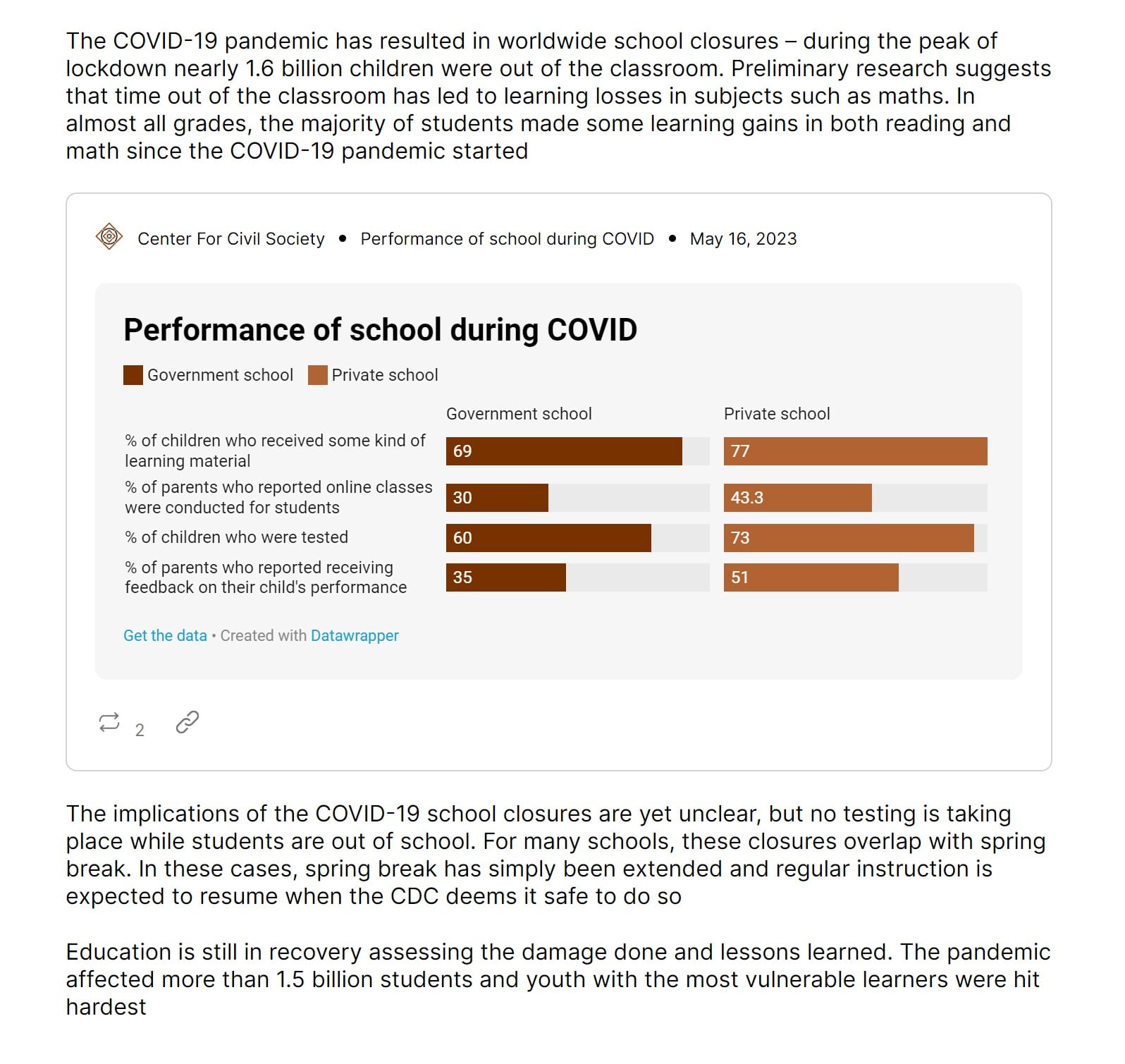
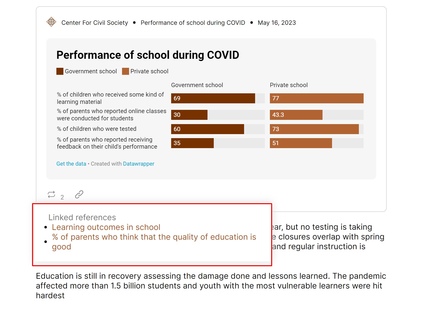
You can also natively embed these Charts inside of your articles.
The same chart embedded in an article
If you are running a newsletter or have social media handle, then your communications team can pick one of these charts and publish them as ‘Chart Of The Day’.
restofworld.org
Why it matters:
Increase direct traffic: All candid communications — journalists, analysts, consultants, policy makers, academics, researchers —keep searching for evidence to build their arguments and insights. Become that destination in your topic of choice.
You’re doing this without any extra effort put in. As candid communicators you are already creating charts to add to your presentations, reports, and analysis. Go ahead and sell your byproducts!
“When you make something, you always make something else.”
Jason Fried, 37signals
To create an e-commerce product, Amazon.com had to create scalable hosting. Their byproduct (AWS) earns them billions of dollars. Charts is a byproduct that candid communicators leave behind.
There’s more! Charts are built to support recirculation, i.e., drive audiences to consume more information.
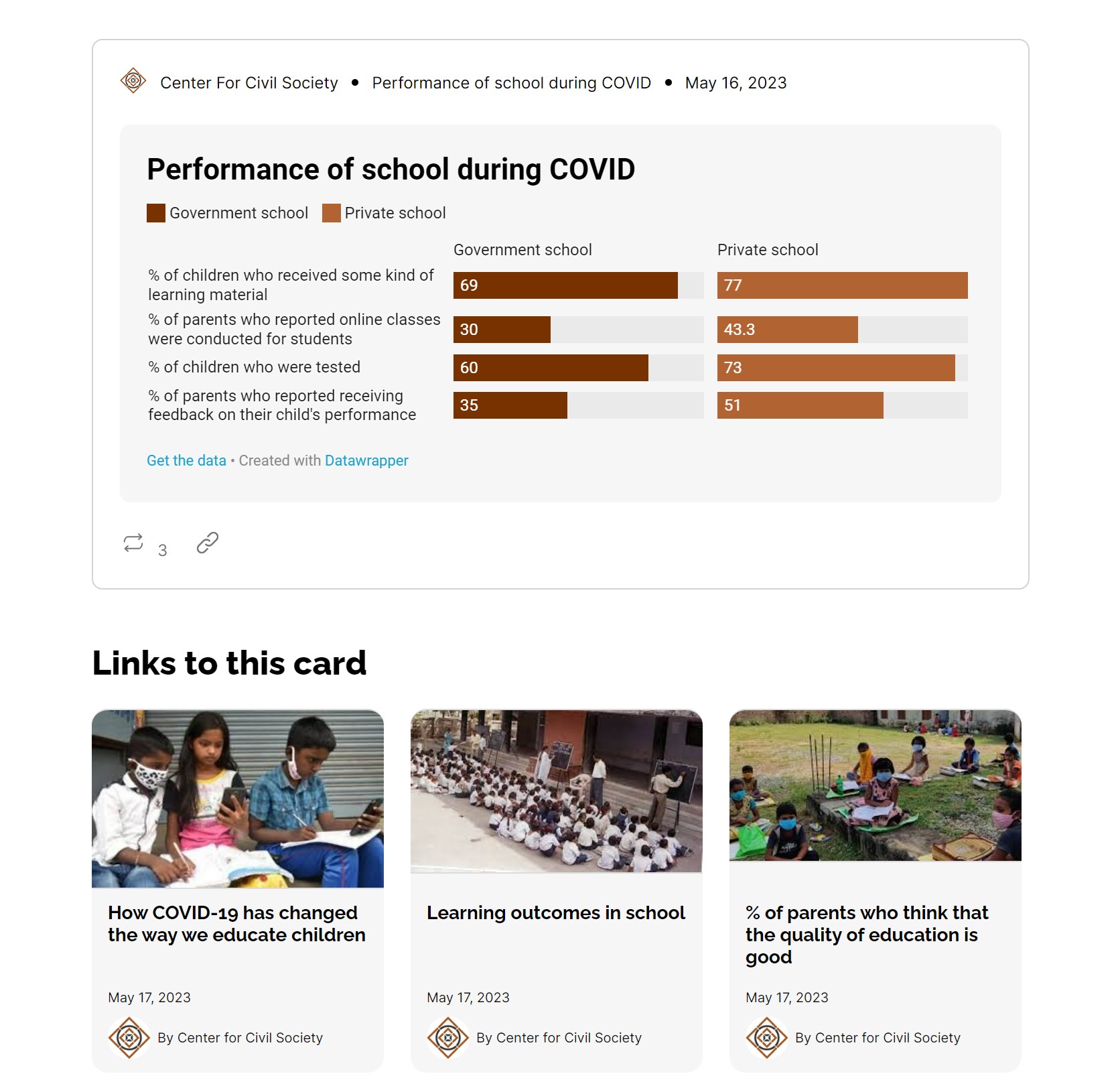
When you see a chart inside an article, you can click the ReTweet like icon and it opens a popup and shows all the other articles where this chart has been used as evidence.
Jump from this article to other articles where this chart has been used
If the user lands to a Chart’s destination page. Then scroll down and you can find ‘Links to this card’, i.e., all the articles where this Chart has been used as evidence.
From a chart, jump to articles where this chart has been used.
How it works?
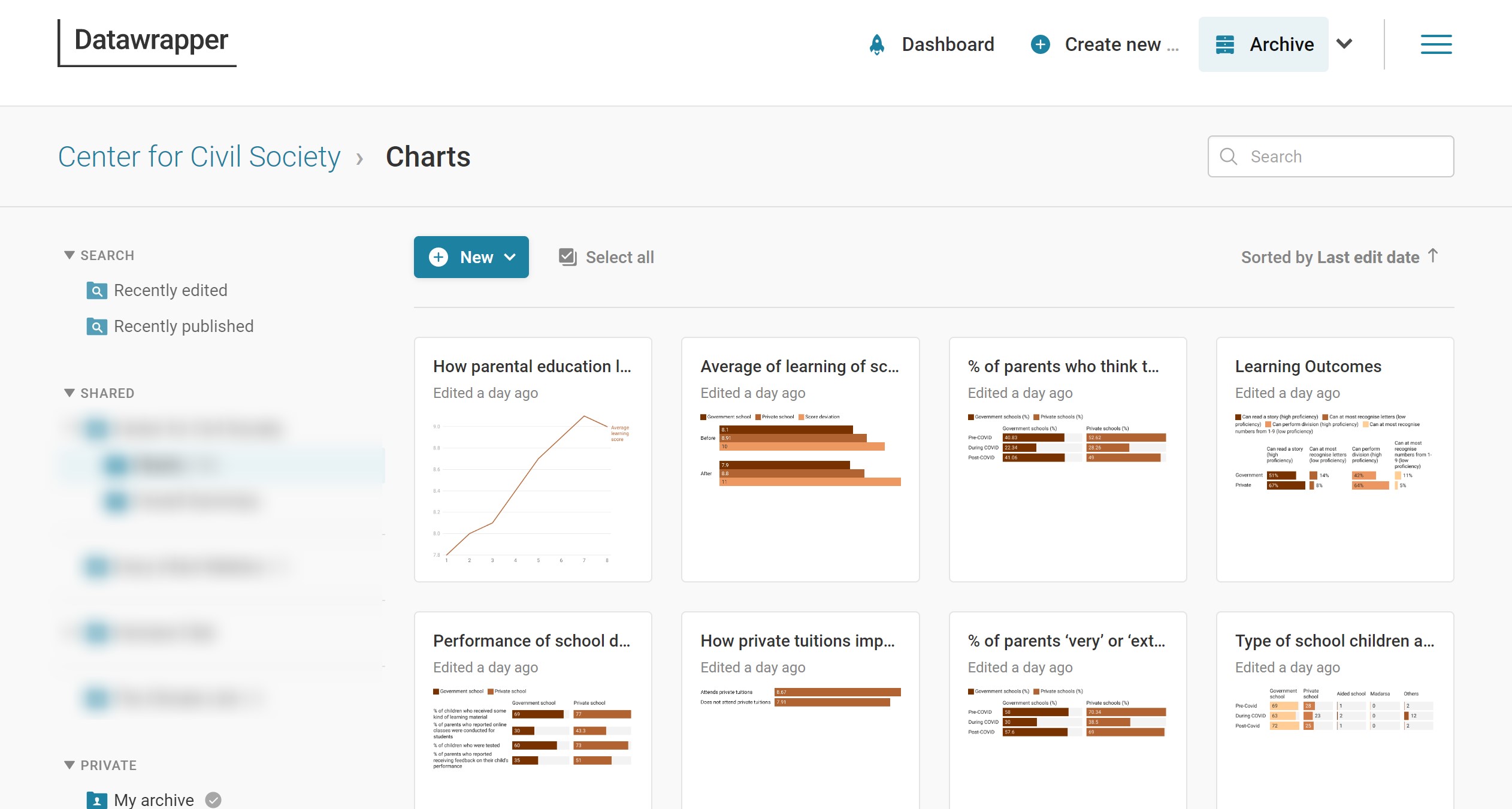
Chart creation: Charting is a solved problem and we did not want to reinvent the wheel. There are many tools available for creating charts, including Excel, Google Sheets, Tableau, and more. We chose Datawrapper — one of the best free charting tools specially designed for candid communicators. Datawrapper is a great tool to create professional-looking charts quickly and easily. You can choose from a variety of chart types, customize the design and colors, add annotations and labels etc.
Datawrapper Charts
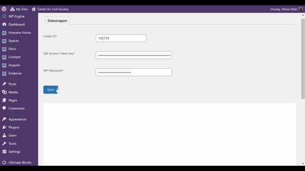
Automatic import of charts: Once the charts are created in Datawrapper, connect with your website. Humane Club integrates with Datawrapper APIs so that there is no manual effort to copy-paste the chart or manually embed them on your website. This saves a great deal of time and effort. You can also update your charts in Datawrapper and they will automatically reflect on your website without any hassle.
Datawrapper Chart import in Humane Club
One last thing: Make changes once and all charts across your site get updated automatically. You don’t have to go around updating all your properties.
Go ahead and check out how Center for Civil Society is using it — see it working here. Reach out to the@humane.club with your ideas — we love hearing from you!